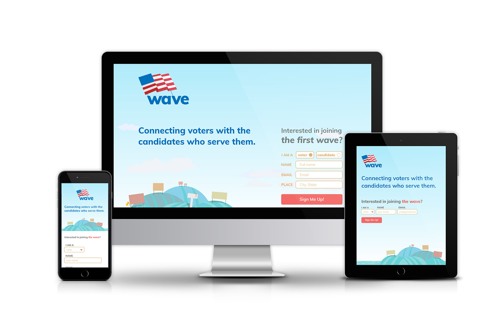
In the summer of 2017, I interned at a tech and web agency in Kingston, New York called Moonfarmer. During this time, I worked on a client project alongside Moonfarmer designer Shauna Keating to design the branding and landing page for a web service that enables public servants to campaign for the support of their community by efficiently distributing lawn signs and other campaign materials to their supporters.
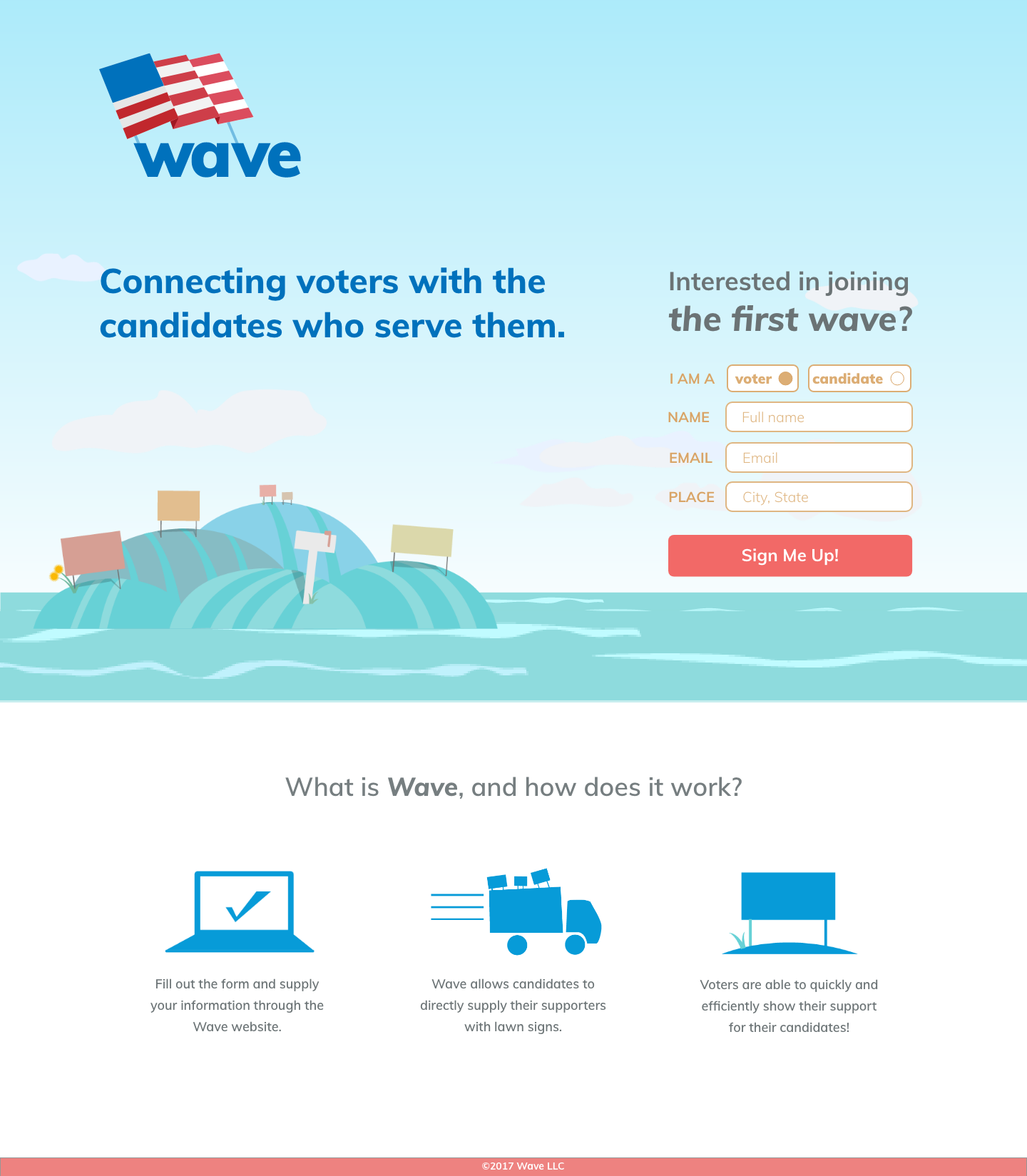
Because Wave connects candidates with voters, it needed to offer valuable functionality to both groups. For voters, the platform offers the opportunity to find and learn about a candidate for public office and request support materials like lawn signs for pickup, shipping, or delivery. They can also share their support for their candidate through social media with easy social share options.
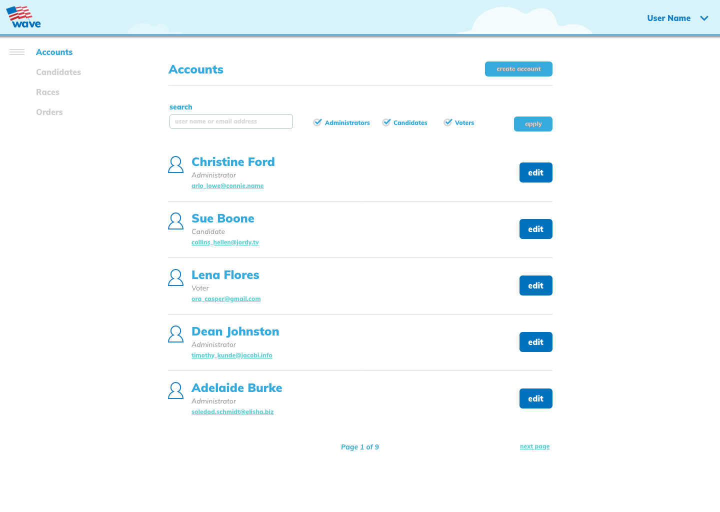
For candidates, the platform offers them a profile that they can customize with an image or logo, a description, and information about their race. It allows them and their team to connect with their voters and view, fulfill, and manage requests for support materials such as lawn signs. They can also message with voters, giving them a direct connection with their supporters.
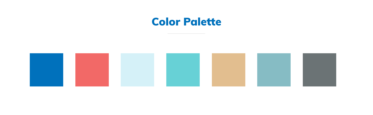
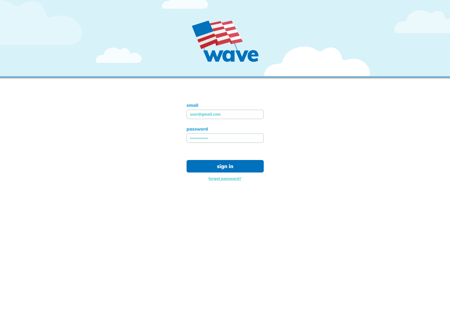
I worked with Shauna to brainstorm and sketch out various versions of a logo that would be fitting for the Wave service. Our brand research revealed that many tools intended to help with voter advocacy or local government are serious and even a little dry. We designed Wave to feel friendly and make getting involved in politics approachable for more people.
The name itself implied a movement, and a water theme, so we started out creating a logo that incorporated an ocean wave motif, using a blue color palette. Secondly, we brainstormed an iteration that incorporated the political aspect of Wave and began to iterate on a version that used the United States flag. Finally, our third iteration of the logo incorporate both the wave motif, and the flag; this was ultimately our winning logo.
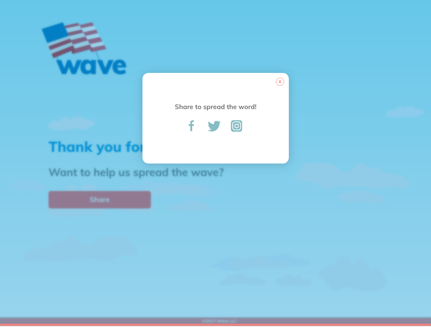
As part of this project, I also focused on creating illustrative elements that could be used in the branding and landing page design. I wanted to emphasize the imagery of lawn signs, so my illustrations incorporated this in a clean and simple way.

At this point, our palette was primarily centered around shades of blue, with a pop of red to bring in more of the United States flag, but to tone it down we used subtler and neutralized shades of those colors in our palette. Because a lot of the branding centered around the image of lawn signs, greens were also used in the palette.
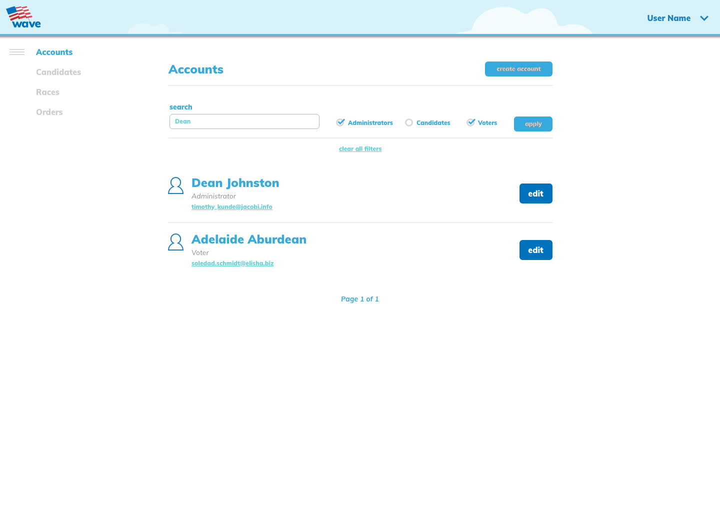
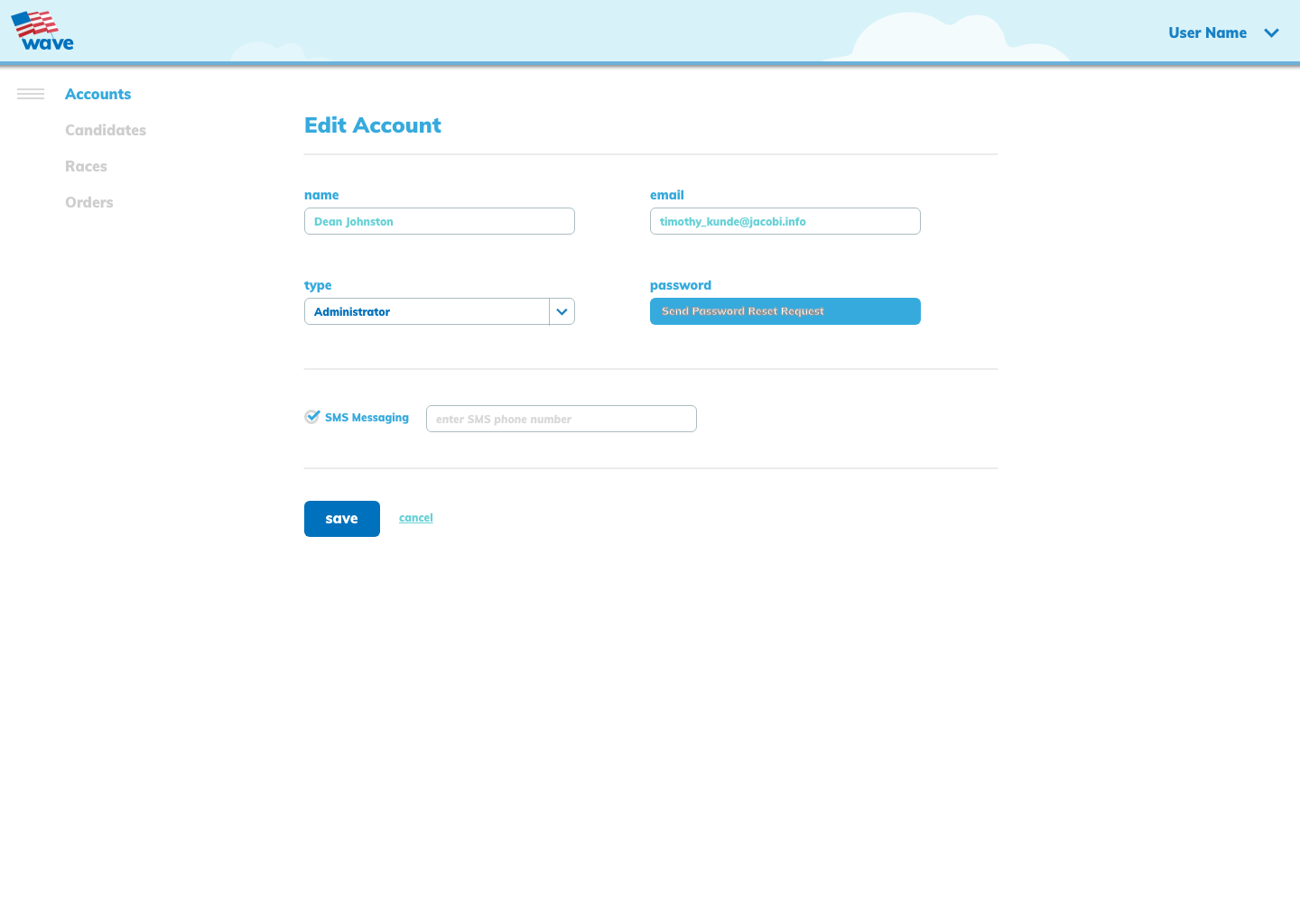
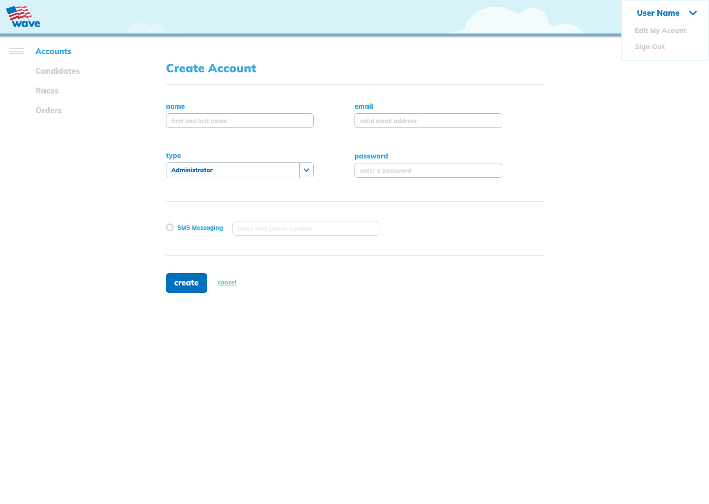
We worked in Sketch to collaboratively create high-fidelity prototypes of the site. Shauna worked on the information architecture, and on the design of the system administration UI, and I worked on the design of the landing page.
On my end, I worked primarily on the design of the branding and the basic layout of the landing page. On Moonfarmer's end, the project was built with scalability in mind—although at the time we were building the app it was intended for use in local political campaigns, the plan was to prepare for a larger usage on a national scale.