Modernizing the internet’s first 3D model asset store.
TurboSquid is a 3D stock content marketplace that caters to creators building video games, architectural concepts, and film. As one of the first 3D stock content sites on the internet, and without design attention for many years, I was assigned to work on this brand and help improve and modernize the user experience in order to increase retention, bookings and reduce drop-off.
Problem
Total revenue is decreasing YoY which is largely driven by returning customers not re-purchasing assets. At the close of Q1 2024 we were down -19.9% YoY in revenue. The online marketplace for 3D model assets has become more competitive – when TurboSquid first entered the sphere, there wasn’t any other 3D model e-commerce site, but now there are several options, and after acquisition by Shutterstock there was very little investment in user experience (until I got to join the party, yay!) The website lacks implementation of crucial ecommerce UX best practices, resulting in an outdated appearance and feel. There are significant friction points that exist within the main conversion flow, highlighting missed opportunities for improvement. In addition, there is a lack of accessibility adherence, which may impact SEO.
Discovery


Reviewing best practices
I leaned on Baymard Institute to get some initial insights on where to start. My main focus was on high converting areas of the site:
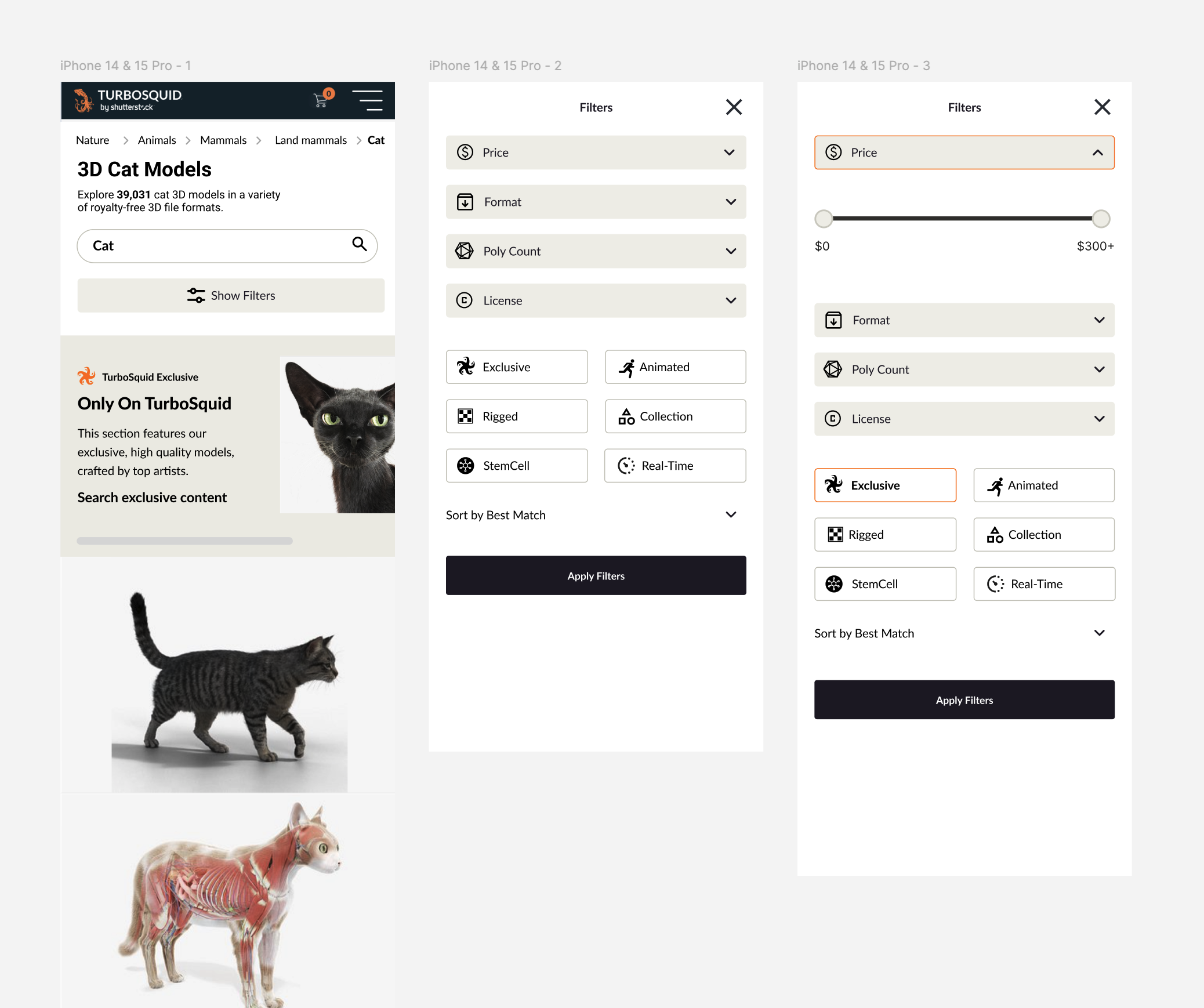
Search result pages
Recommended listing the price of an asset directly on the search result tile
Make sure to explain industry-specific filters via tooltip
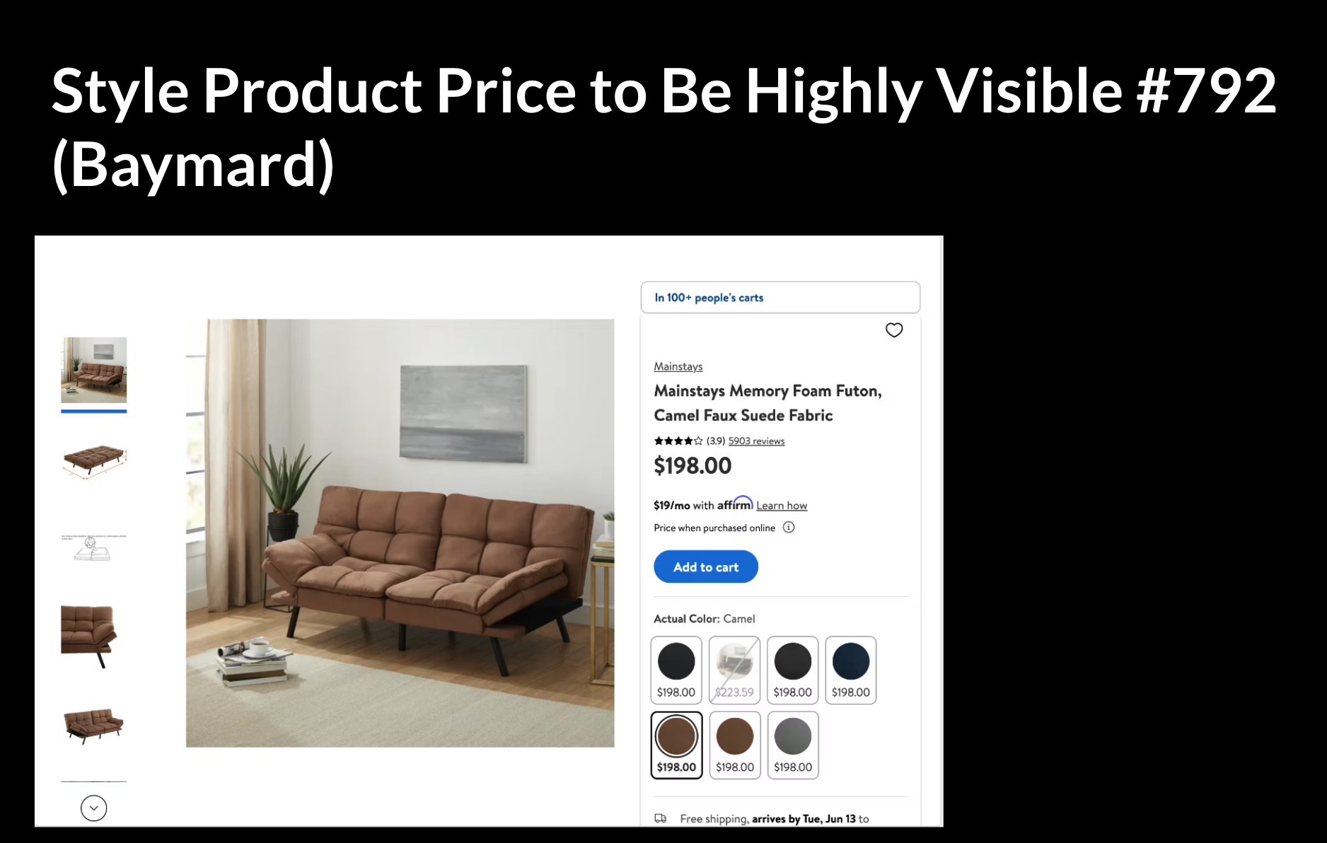
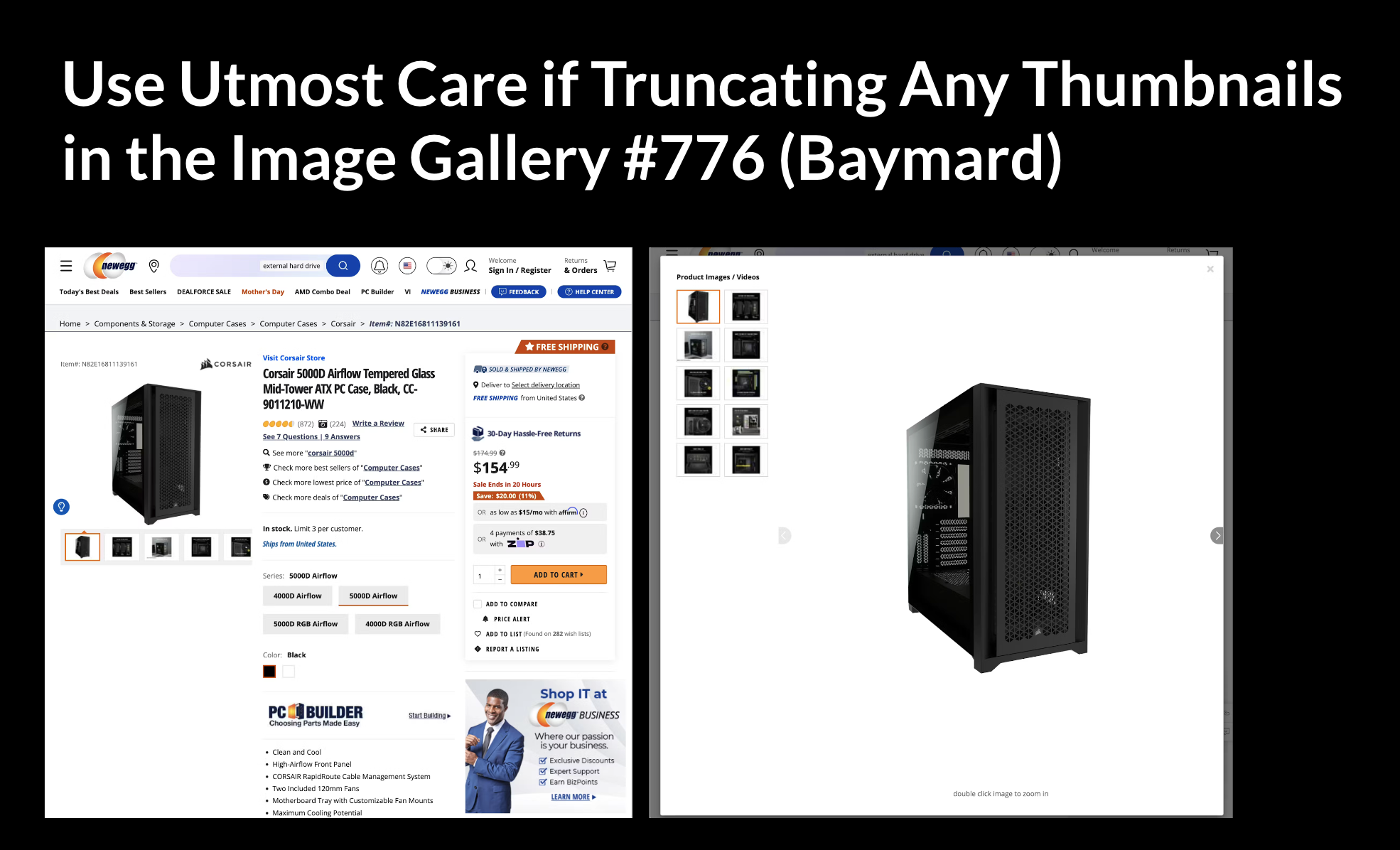
Asset detail pages
Style the price to be more prominent
Image gallery on the asset detail page could be much improved
Cart + checkout
Get rid of the “express cart” that was currently being utilized on production
Use an enclosed checkout design - meaning, remove the main navigation to keep the user focused within the checkout
Workshop
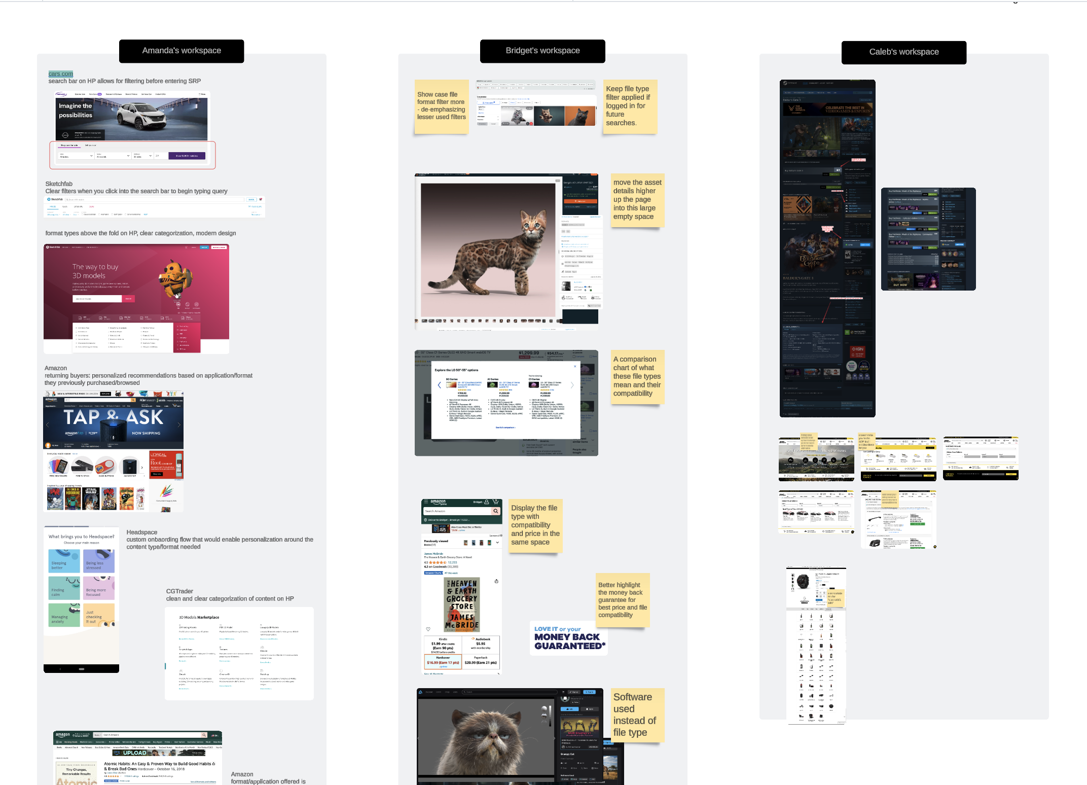
I conducted a lightning demo workshop with the larger design team to help brainstorm ideas around a problem that had been surfaced in speaking to TurboSquid customers, being: How can we help surface compatible content and build confidence it will work for our customers?
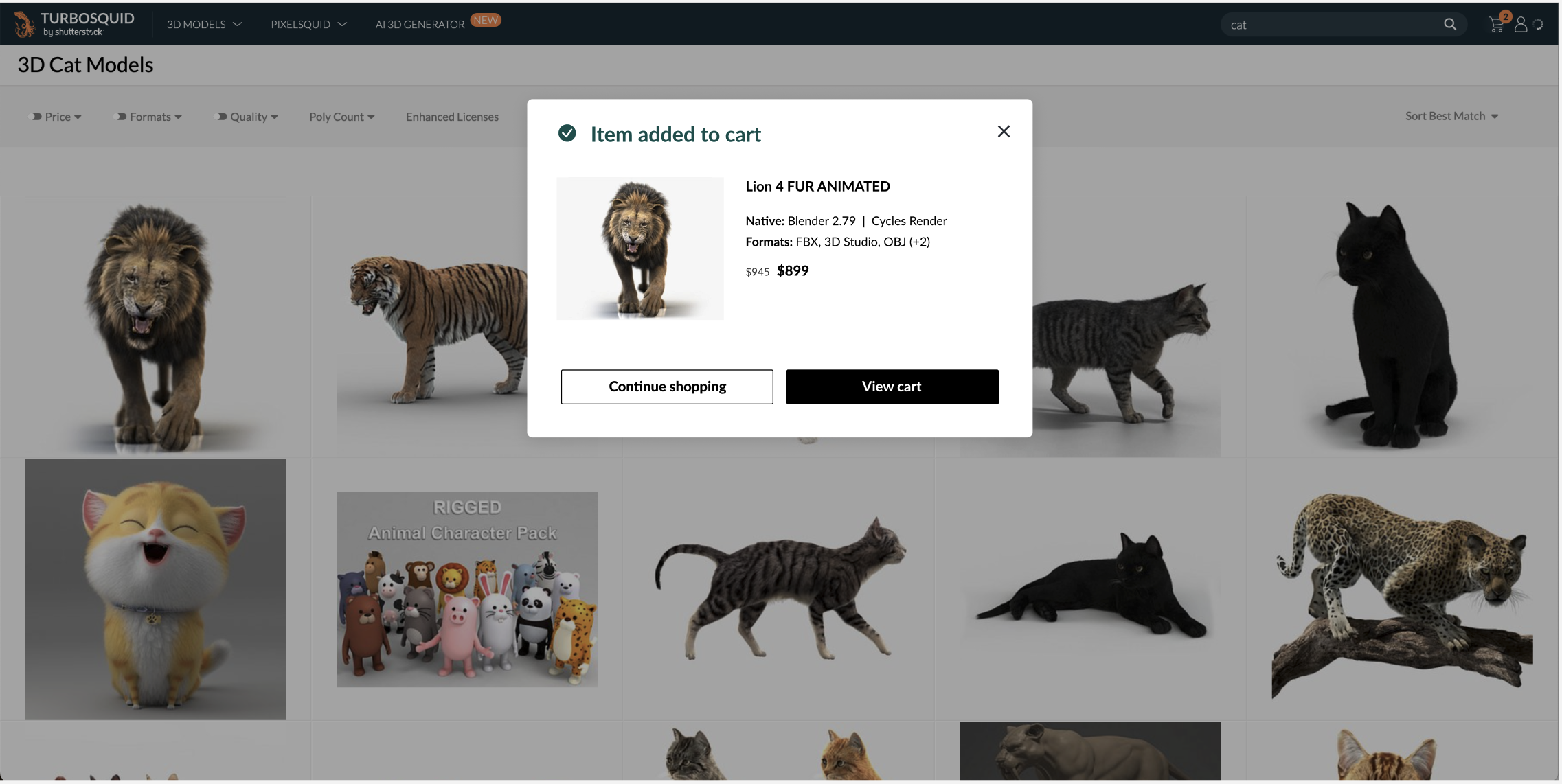
Many of the 3D assets uploaded to the marketplace by contributors are compatible with different applications, but are created in a native format. Assets typically work best in the native format, and there’s quite a bit of filtering that customers have to do in order to find the formats that work for whatever project they’re working on.
I asked the team to find examples of other products that are solving a similar problem (not limited to the 3D space). We found a broad range of inspiration, much of which focused on search and discovery being a key aspect of determining compatible formats for the user.
Design synthesis
A/B testing and experimentation
Building off of the discovery phase, we recently launched a series of A/B test, which implemented the recommendations from Baymard’s research.


Design system + handoff to engineering
The creative team at Shutterstock went through a rebranding exercise for TurboSquid. They passed the new design specifications to me, and my job was now to translate this to a product design system in Figma, and then prepare it for handoff to engineering.


Applying the rebrand to the homepage
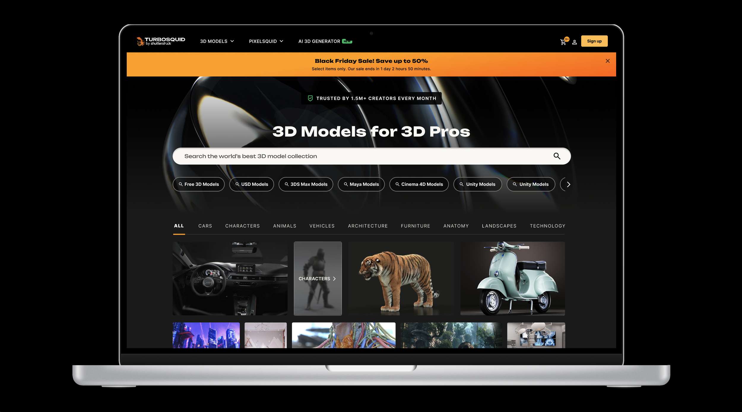

The TurboSquid brand closed Q2 2024 at a 9% decline YoY, which is a 10.9% increase from the previous quarter. We’ve also seen a 5% increase in free browse account signups YoY, which is a very promising indicator of growth. Simultaneously, traffic and AOV has grown when comparing Q2 to Q1 2024.