My Sister in Data
Visualizing an Online Relationship.
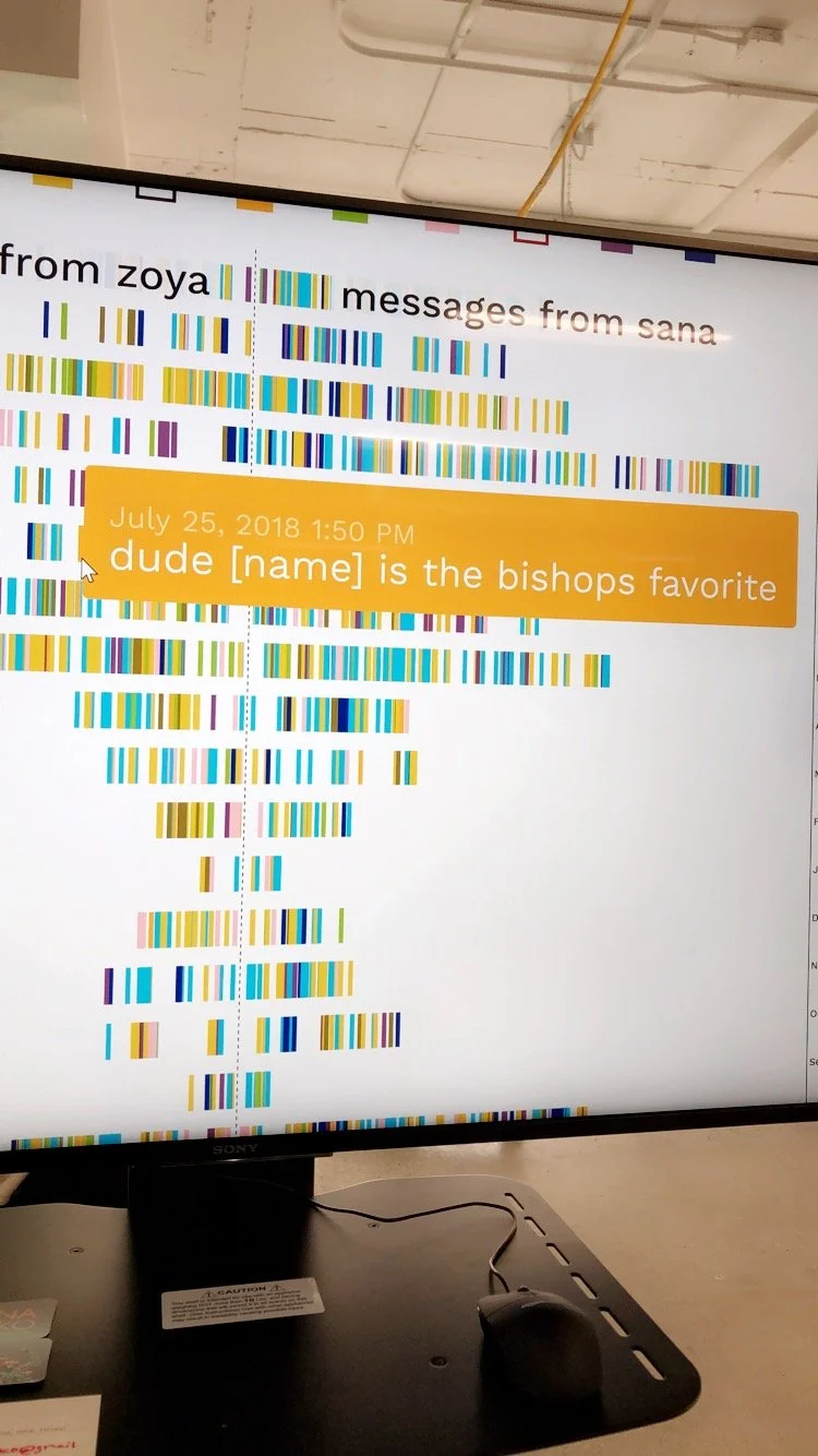
My Sister in Data is a two-year graduate thesis project that I created for the Master's in Digital Futures program at OCAD University. The project includes an interactive data visualization out of Facebook messages between my sister and I from 2010-2019. The visualization is embedded on a webpage, and visitors can hover over a message to read its contents. It shows the growth of communication over time, and shows the emotional categories of messages through use of color.

This project speaks to a desire to comprehend a changing, technologically-enhanced social world and the relationships contained within it.
The purpose of this project was:
1. to explore how changing time and distance affected the ways in which Facebook was used as a tool to help maintain the relationship between my sister and I, and
2. to expose seemingly private conversations to an audience as a way to reclaim online content that is debatably not our own to begin with.

Research through design
This project uses a research through design (RtD) methodology, which is a form of research that acknowledges creation as a form of discovery. RtD is used in tandem with methods from autoethnography, allowing the particular case of personal data used in this project to be contextualized in the reflective methods of an autoethnographic approach. I also used data visualization methods outlined by Ben Fry in his book Visualizing Data (2008), which involved:
Acquiring the dataset
Parsing the data and creating a structure
Filtering data
Data mining to find patterns in the dataset
Representing the data through visualization
Refinement of the design
Adding interactive elements to visualization
Process
My first step was to download the message history dataset from Facebook and to filter out mentions of other people. My next step was to understand the message data file; what information it contained, what parameters could highlight meaningful insights, and what patterns I might be able to find in the data. In order to begin experimenting and understanding the dataset, I chose to use Tableau, a data visualization software that enables creating visualizations out of datasets within the Tableau interface without requiring programming knowledge. Using Tableau’s bar chart visualization, I discovered the message text content that was most frequently sent between me and my sister.
Data Sketches
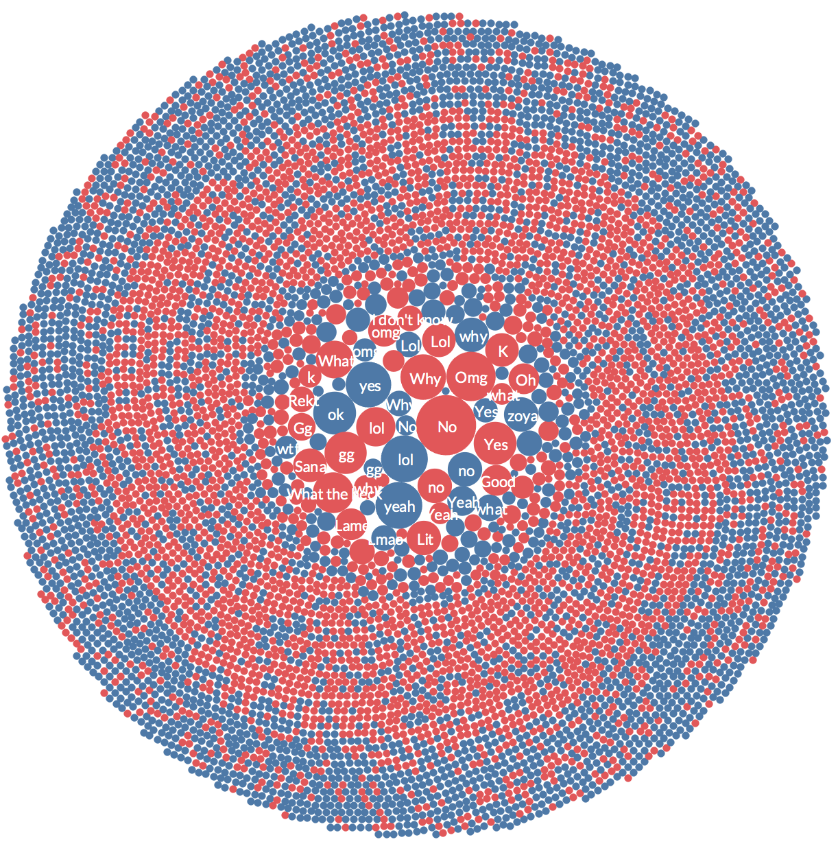
Using the same concept of visualizing the most frequently sent messages, I iterated a data sketch as a clustered bubble chart. The different colours show who sent the message.
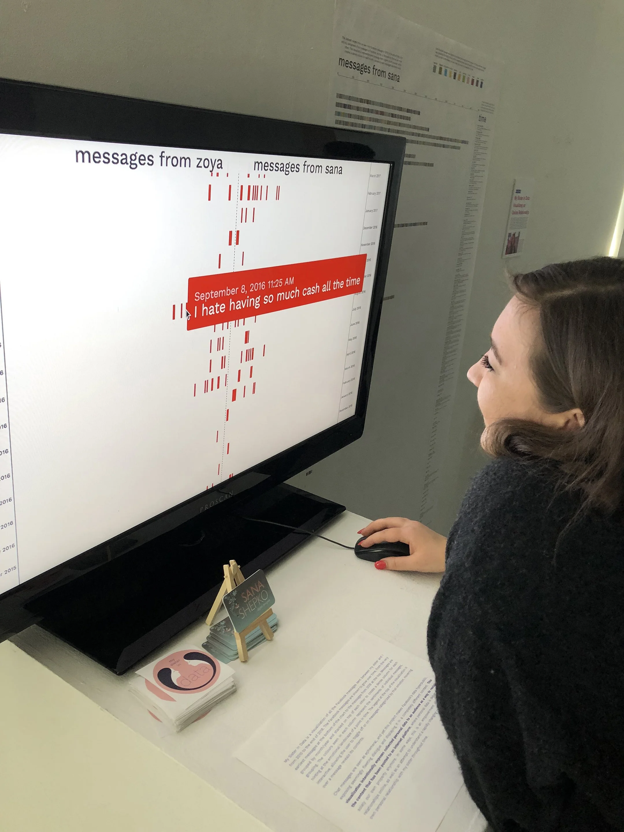
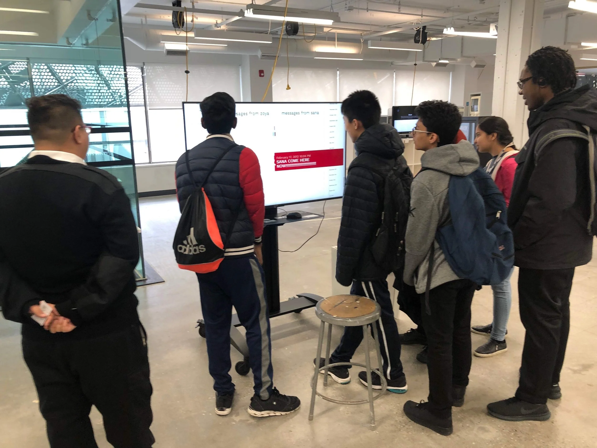
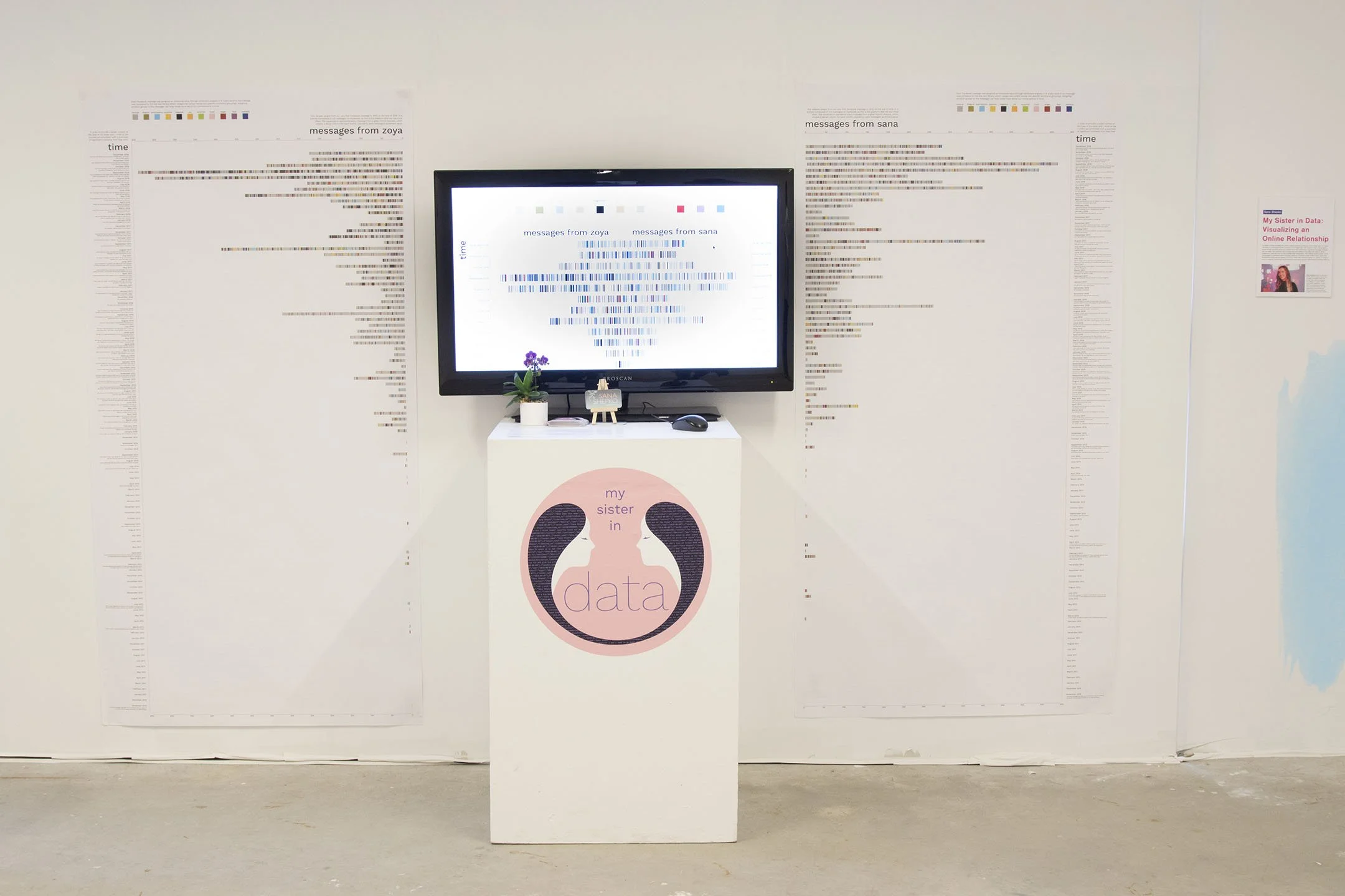
Installation + Final Prototype
For the Digital Futures graduate thesis exhibition, I ran the data visualization website off a local server on my computer and connected it to a large monitor. I felt it would be important to be able to see the visualization all at once rather than to be limited to scrolling through it on the screen, so I created two large posters, split into messages from Zoya and messages from me, that showed the entire span of messages over time. These posters included guiding annotations above each axes and above the sentiment legend to help lead a viewer through understanding how to read the chart. Each time frame in the time axes had an annotation, summarizing the big events of that time and what the gist of the message data at that time was about. This allowed the project to be more contextualized in the lived experiences of Zoya and I rather than an abstract visualization.
For future consideration, I believe that there are many more directions that this visualization could take that would allow a user to dig deeper into the huge amount of data available. For example, I initially wanted to include the ability to change timescales. At its current state, the visualization is fixed on a monthly timescale. However, giving the user the control to change the timescale to a weekly, daily or even hourly rate would make it possible to have more control over the visualization and to isolate specific points in time.