During my graduate studies at OCAD University, I took a course called From Data to Perception, which focused on studying the ways that data can be displayed to invoke meaningful communication and understanding. The Meteorite Landings Interactive Map was the culmination of an assignment which asked students to portray a dataset with more than 5,000 records. As someone who has always been interested in astronomy, I was drawn to exploring NASA's database library. Working with two other students in the class, we began diving into the project, and chose a dataset from NASA's Open Data Portal that documented all of the historical and predicted meteorite landings on Earth. The dataset includes recorded meteorite crashes dating back centuries, resulting in over 40,000 records.
At the outset of the project we decided we wanted an element of exploration within the data visualization. This would engage the viewer with the data, allowing them to become more invested in the information itself.
We then began to look for tools we could use to realize this goal. After debating tools like D3.js and Tableau I discovered Mapbox; an online data visualization tool for representing geographical data. The features would allow for an initial iteration of the map but would require coding in order to make it more interactive and utilize additional features.
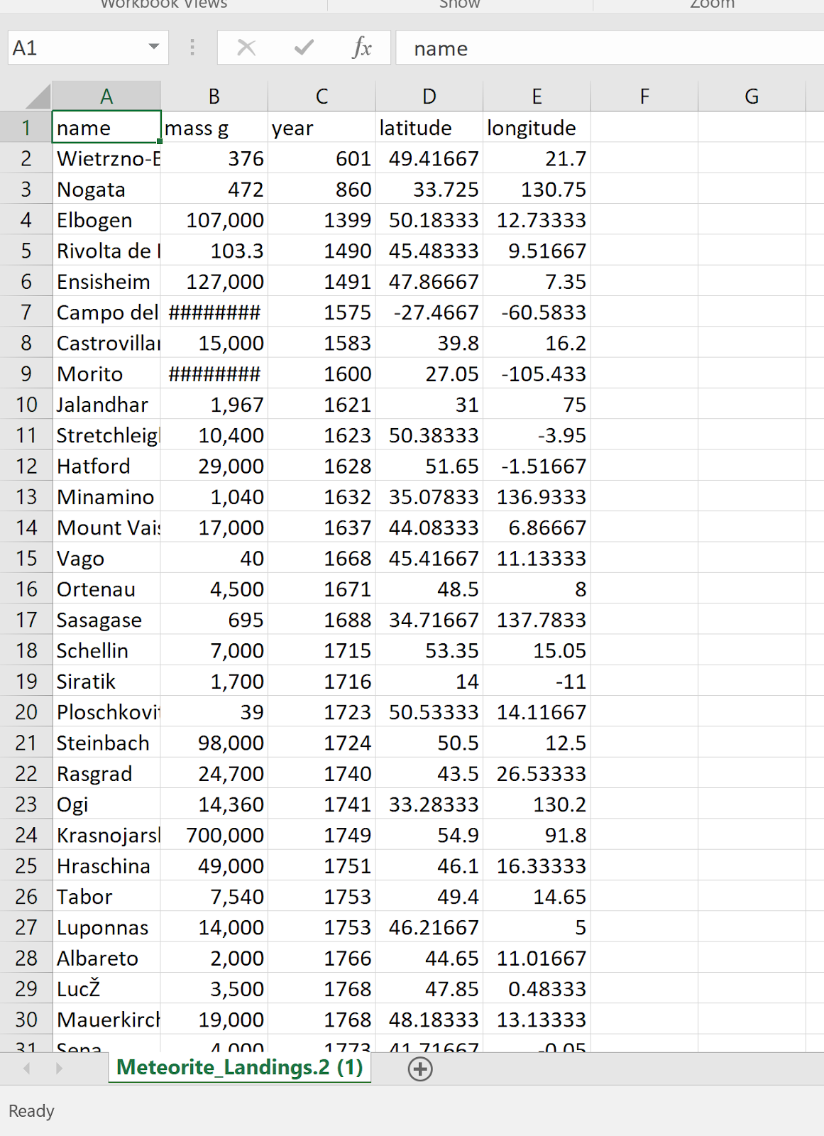
The process included cleaning up the data spreadsheet downloaded from NASA. Empty sections needed values, while latitude and longitude needed to be separated into their own columns.
Once this was done we were able to upload the data to Mapbox for the initial version of the map. We then decided on the overall look of the map; we wanted it to reference the night sky so we chose a dark base for the map with blurred and light-coloured ellipses.
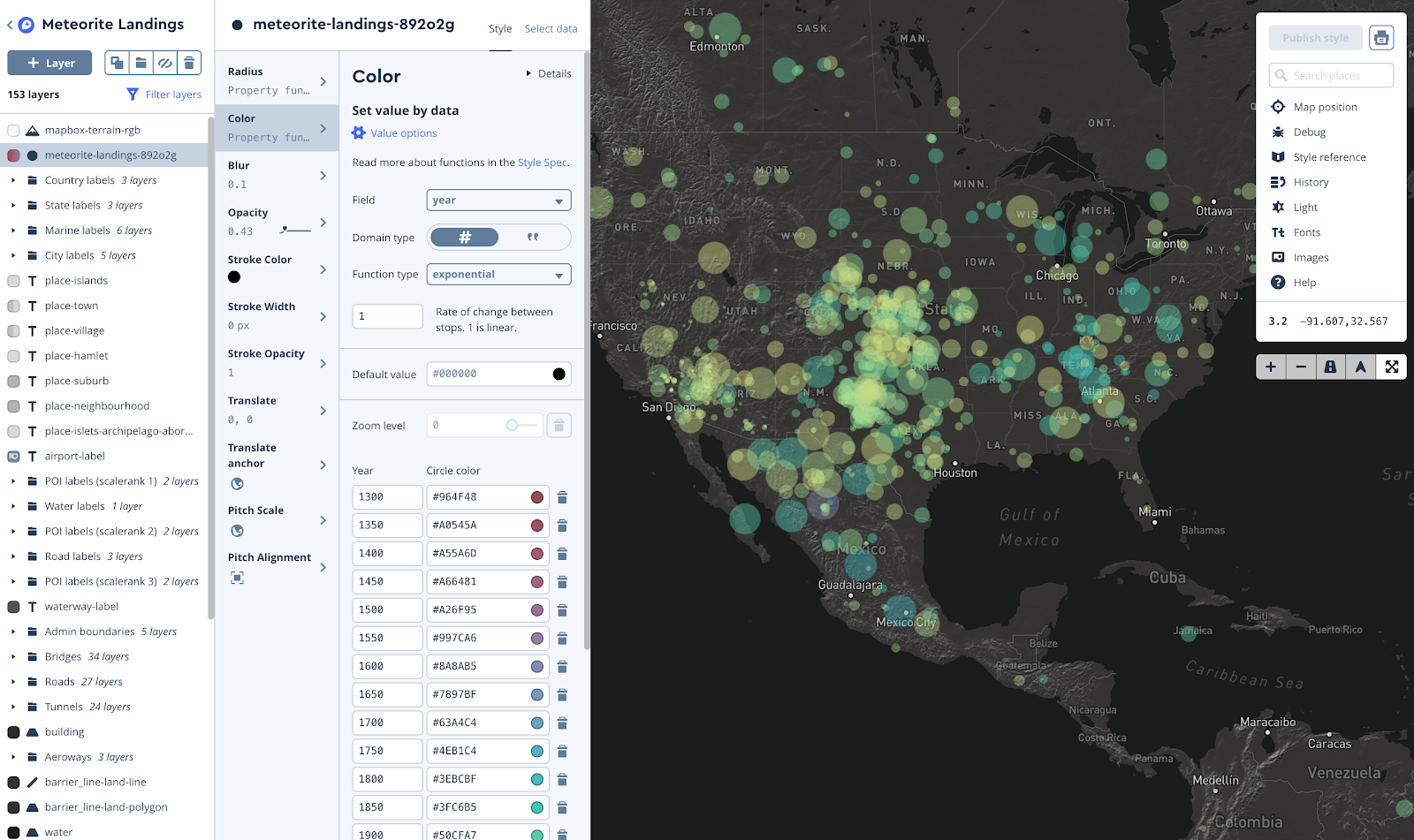
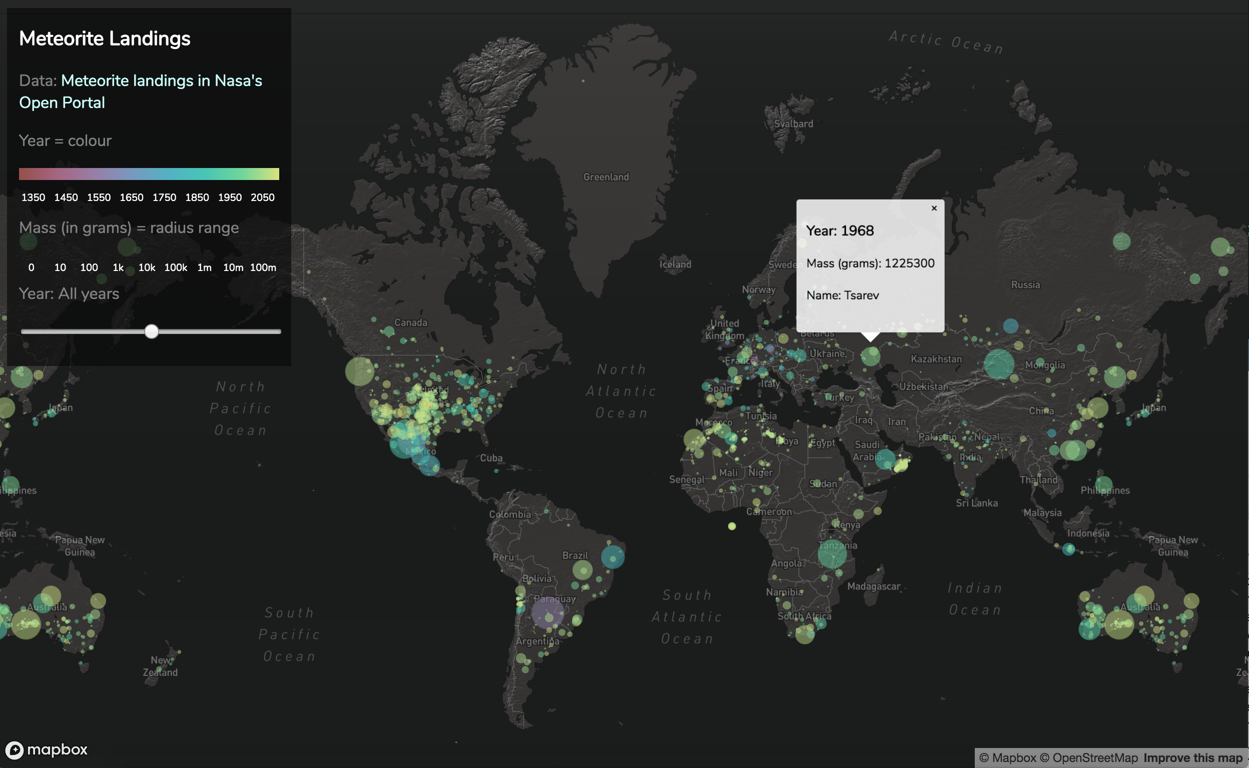
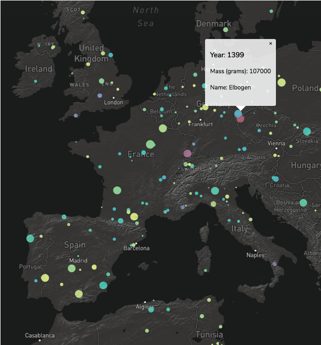
From here we needed to make the map more specialized. Year ranges were assigned colours to distinguish the age of the meteors, as well as additional information upon clicking on an ellipse.
Sound was also discussed by all, but we were not able to find a way to incorporate it in an intuitive way.
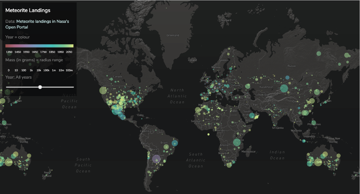
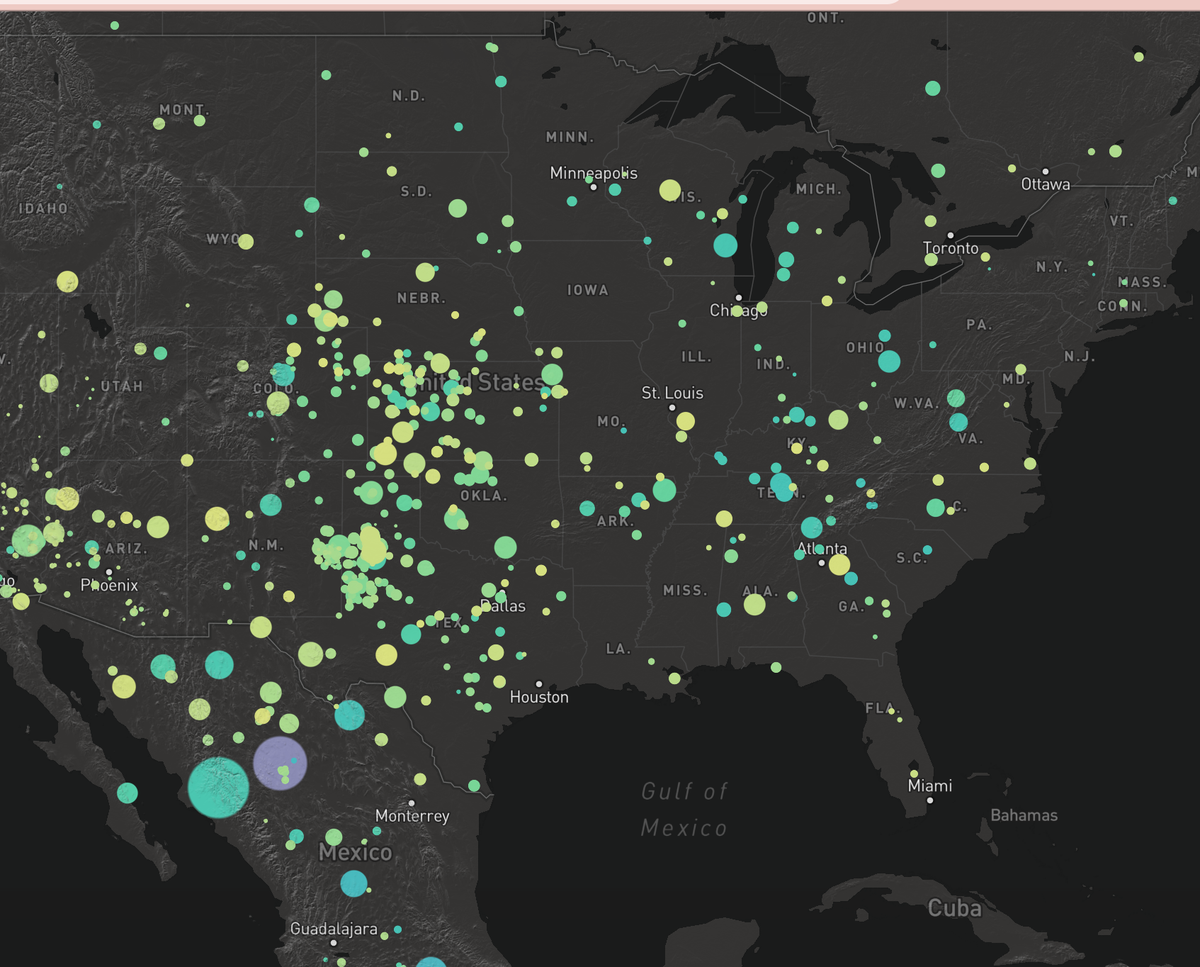
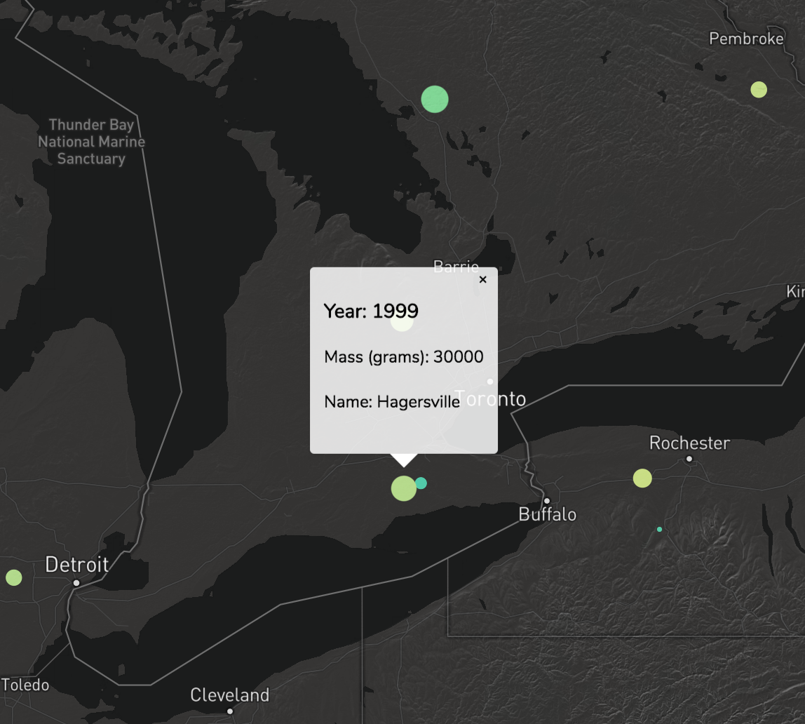
The project is an interactive world map depicting the crash sites. The mass of the meteor is reflected in the size of the ellipses representing the crash while the colour indicates the age of the report. For instance, older reported crashes are pink while more recent ones are yellow. Clicking an ellipse will offer more information about the meteor, like the exact mass, year, and name. Zooming in on a location will reveal smaller meteors, and utilizing the slider tool will allow the user to see crashes throughout time rather than all at once.
There are a lot of directions that we could take a project like this in future iterations. As mentioned previously, sound is an area that we would have liked to explore and we hope to find an intuitive and complementary way to incorporate it.
It would also be interesting to have the ellipses appear in the historical order of their fall, as an animated sequence before the viewer begins exploring the map. This way a user might better be able to see an accumulation of the meteors and feel the impact of the data.